» blog archives
the blogger years
malapropism
crazy
the movabletype years
my name in print
blogging tools
chapter 5: blueflower.org v2.0
(june 2001 to november 2001)
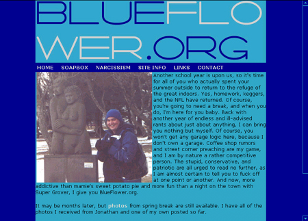
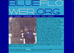
Blueflower.org v2.0 was launched on June 15, 2001. I'm quite amazed that the first layout lasted for a full year, because I really hated it. I won't go so far as to say that v2.0 was a full-on backlash against v1.0, but I basically threw out the old design, kept the only element from the first that I liked (the navigation menu), and otherwise started anew.
Man, did I hate that yellow. It was a nice contrast to the blue - something which most subsequent designs have lacked - but man, did I hate that yellow. As a result, this new design was nothing but blue. It had a light blue that approximated the sky blue from the original design and a darker, more royal blue. Text was black and links were white.
I also hated that original blueflower.org logo. Was that bad? Yeah, that was bad. This new one I really liked. It would have been better had I spaced and kerned the two lines so they were the same length and closer together, but it was a pretty cool idea for a logo, and I thought it worked well with the overall design. The font employed was Salaryman.
Since the use of blue gave the site a cold, wintery feel, I used a photo of me in Iceland on the front page. You can see I'm all bundled up in my blue hat and winter coat and standing in the snow next to a sculpture. It wasn't that cold, but it was cold enough, and I was sick as well.
What should stand out the most on this layout is the one thing that differentiates it from all the other other layouts I've ever done for blueflower.org. Can you guess what that is? That's right - no side columns. I had grown weary of the frivolous side columns and decided to eliminate them altogether for this layout. It streamlined the design more, which made it more in fitting with the logo.
The navigation menu is almost precisely the same as the one from the first version, with only one change. Because I had removed the side column, I included a link to contact information in the navigation menu. Instead of going to a seperate page, clicking on CONTACT opened up a little pop-up window with my contact information.
This design also integrated a new trick I had learned - the ability to change the colors of scrollbars in Internet Explorer. As a result, the scrollbars matched the colors of the rest of the site for anyone using IE5.0+.
Although I did rather like this design, all the blue without any sort of contrast got to be a little too depressing and I had to move on.
» design history
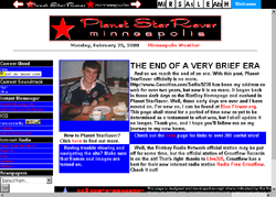
planet starraver (12/99-6/00)
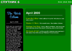
sputnik 6! (1/00-4/00)
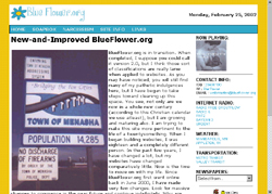
blueflower.org v1.0 (6/00-6/01)
blueflower.org v2.0 (6/01-11/01)
blueflower.org v3.0 (11/01-6/02)
blueflower.org v4.0 (6/02-7/02)
blueflower.org v5.0 (7/02-1/03)
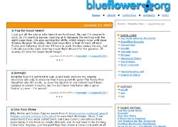
blueflower.org v6.0 (1/03-3/03)
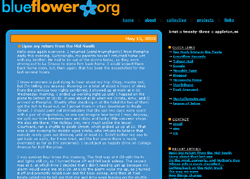
blueflower.org v7.0 (3/03-6/03)
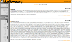
blueflower.org v8.0 (6/03-7/04)
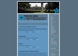
blueflower.org v9.0 (10/04-12/04)
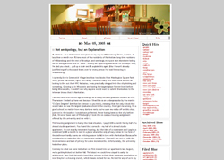
blueflower.org v10.0 (12/04-7/05)
