
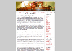
» blog archives
the blogger years
malapropism
crazy
the movabletype years
my name in print
blogging tools
chapter 2: planet starraver
(december 1999 to june 2000)
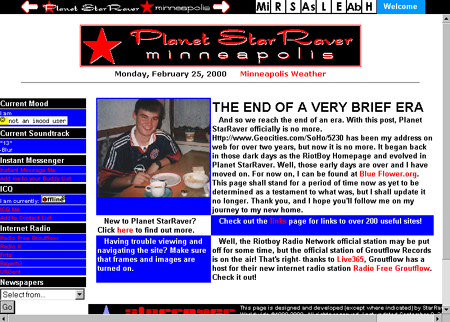
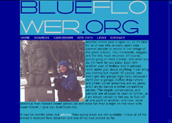
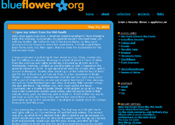
Most simply put, Planet StarRaver was the culmination of all the HTML I had learned in the 18 months since I started designing websites. It was the last time my main personal site would include frames. I made use of tables to create columns and to further layout the page. I had a navigation menu on top which made use of rollover images. Okay, I'll admit it, I stole the JavaScript for the menu from the website for the A&E section of the Minnesota Daily.
Each of the square images on the navigation menu was meant to look like a square on the periodic table. The menu consisted of 8 squares: Mi (Minneapolis), R (Riotboy Radio Network), S (Sputnik 6!), As (Asphyxiation), L (Links), E (Email Me), Ab (About), and H (Home). The squares were white when not in use, but when hovered-over or clicked-on, they changed to different colors of the rainbow - red to purple from left to right - which I suppose was rather fruity, but it didn't occur to me as much at the time. Next to the name of the website on the navigation menu were white arrows. When rolled over, the arrows turned red, and were links to go forward or back in the browser's history.
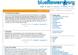
The goal of the layout was to approximate the look and feel of a newspaper. For that purpose, I had a logo with the name of the website on top, followed below by the current date and a link to the current weather in Minneapolis as posted on Weather.com. Below that, there was a small column on the left with links to pertinent information and a pulldown menu with links to newspapers I read often at the time. The main section to the right consisted of a photo of me circa 1997 and partitions of little bits of information. I wasn't much of one to experiment with colors at all, so excluding the rollover images in the navigation menu, the colors consisted chiefly of straight red, blue, white, and black.
The Minneapolis page was my section with club and coffeeshop reviews and listings of upcoming movies, concerts, and raves. I was thoroughly convinced at the time that I could make a name for myself locally with my website listing all the best places to go and all the best things to do in the Twin Cities, but being 19 and a college student, I had neither the time nor the ability to achieve that goal at that time.
The Riotboy Radio Network was going to be my live internet radio station. I had downloaded a Real Server and was working on configuring it to broadcast live radio shows over the internet from my dorm room in Minneapolis. The biggest thing holding me back wasn't software, but rather hardware. I had no microphones (other than the crappy built-in one on my monitor) and no mixer. Any attempts to broadcast with the equipment that I had would have been disasterous. In the mean time, I set up Radio Free Groutflow on Live365. Radio Free Groutflow consisted of a couple hundred mp3s of songs from my CD collection, along with some tracks by Groutflow artists like Groutboy and Asphyxiation, and some randomly inserted station identification tracks I had created. That was back in the days before the RIAA won their court case and internet radio broadcasters had to start paying royalties. As soon as that happened, Live365 started charging for radio stations, and that was the end of Radio Free Groutflow.
We'll discuss Sputnik 6! in the next chapter.
The Asphyxiation section was long THE official website of the band. It consisted of biographies of the band members, a history of the band, information about shows past and future, and Real Audio clips of songs by the band. All the same information can now be found on the Groutflow Records website.
The Links page was styled after a links page found on a website about raves in Toronto. Compared to other links pages I had seen on the internet, I really liked the design, layout, and colors. My version consisted of alternating lines of green and blue with red links and a black background. In fact, the actual layout of my links page hasn't changed all that much even upto the newest redesign of blueflower.org in 2005. The links page back then was ginormous, with links to over 200 websites. The size has fluctuated over the years, and is now down to about 80.
The About section consisted of a largely fictional - yet rather amusing - autobiography. It was based in reality, but I added a little pizzazz to make it more interesting. Linked off of there was a glossary page of terms associated with BYFing, including all the favorites from "Harvesting the Crop" and "Mr. Metallica" to "The Fork" and "Asslick". If you don't already know what BYFing, it's not worth asking.
Proud of the hard work put into designing the site, this was the first time in which I credited the site design and layout to my "design firm" starraver industries. All subsequent websites have credited starraver industries with the design work on my sites.
» design history
planet starraver (12/99-6/00)
sputnik 6! (1/00-4/00)
blueflower.org v1.0 (6/00-6/01)
blueflower.org v2.0 (6/01-11/01)
blueflower.org v3.0 (11/01-6/02)
blueflower.org v4.0 (6/02-7/02)
blueflower.org v5.0 (7/02-1/03)
blueflower.org v6.0 (1/03-3/03)
blueflower.org v7.0 (3/03-6/03)
blueflower.org v8.0 (6/03-7/04)
blueflower.org v9.0 (10/04-12/04)
blueflower.org v10.0 (12/04-7/05)